Live Preview
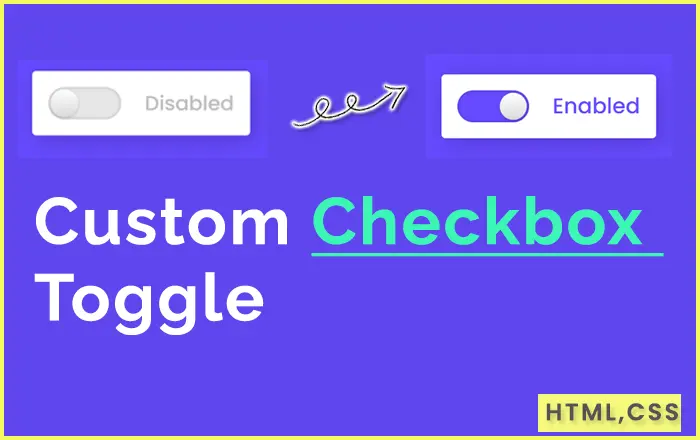
index.html
<!DOCTYPE html>
<html lang="en" dir="ltr">

<head>
  <meta charset="utf-8">
  <title>Custom Toggle Button</title>
  <link rel="stylesheet" href="style.css">
</head>

<body>
  <div class="checkbox">
    <input type="checkbox" id="click">
    <label for="click" class="text"></label>
  </div>

</body>

</html>
style.css
@import url("https://fonts.googleapis.com/css?family=Poppins:400,500,600,700&display=swap");* {margin: 0;padding: 0;box-sizing: border-box;font-family: "Poppins", sans-serif;}html, body {display: grid;height: 100%;place-items: center;background: #664aff;}.checkbox {height: 80px;width: 270px;padding: 20px;display: flex;background: #fff;align-items: center;border-radius: 5px;box-shadow: 5px 5px 30px rgba(0, 0, 0, 0.2);justify-content: space-between;}.checkbox input {cursor: pointer;outline: none;height: 40px;width: 90px;border-radius: 50px;-webkit-appearance: none;position: relative;background: #e6e6e6;box-shadow: inset 0 0 5px rgba(0, 0, 0, 0.2);transition: 0.4s cubic-bezier(0.68, -0.55, 0.265, 1.55);}.checkbox input:checked {background: #664aff;}.checkbox input:before {position: absolute;content: "";left: 0;height: 100%;width: 40px;background: linear-gradient(#fff, #f2f2f2, #e6e6e6, #d9d9d9);box-shadow: 0 2px 5px rgba(0, 0, 0, 0.2);border-radius: 50px;transform: scale(0.85);transition: left 0.4s cubic-bezier(0.68, -0.55, 0.265, 1.55);}input:checked:before {left: 50px;}.checkbox .text:before {content: "Disabled";font-size: 25px;font-weight: 500;color: #bfbfbf;}input:checked ~ .text:before {color: #664aff;font-size: 27px;content: "Enabled";}